
Having a clean and simple design is the mantra of successful websites. And when it comes to designing a financial services website, the industry is under pressure to match pace with the changing technological expectations. Every financial services website is trying to offer a user experience that stands out from the rest. For financial services, the website is the place where they can offer and share what they offer, why they are special, their client testimonials. There are a lot of intricacies in the website of financial services. The website should be designed such that a layman should be able to find what he is looking for.
It is really a critical task to develop a financial services website as there are many things that should be included. It is also a task to take down the list of must-haves and nice-to-haves so that you can allocate resources and plan accordingly. Every institution has different needs but here are a few features that you have to include on the site through which you can go for a website nirvana.
1. Domain name
On a basic level, domain names are important because the Internet’s addressing scheme is not very effective without them. A short, memorable name can make the difference between creating a successful Web presence and getting lost in cyberspace. A domain name adds credibility to the business.
2. Logo
Logo is a visual cornerstone of a company’s brand. A company’s identity is visually expressed through its logo, which, along the company’s name is one of the main things that makes the business memorable.
3. Tagline
 Taglines actually fulfill a very important purpose: they let you quickly and efficiently sum up what your company is all about. A good tagline helps set the brand apart from other companies that provide similar products. And putting a tagline on the webpage can reap good benefits.
4. Calls-to-Action buttons
 Make sure that your content has calls-to-action (CTA) buttons and that should be clearly visible on the page.
Calls-to-action includes buttons that lead to gated pages, lead generation forms, social sharing icons, email subscriber forms, download buttons, progressive profiling forms, click-to-call phone numbers, video demos and email-to-a-colleague forms.
Since the customer’s journey is the top priority, the CTA should navigate the customer in the right direction. The CTA should be there on the pages as soon as it loads and should be there on all the product pages.
5. Phone numbers
Never forget to put phone numbers on the website. If a user is stuck at something, he or she will look up to the respective branch phone numbers for help. The financial services institute can get many leads with the phone numbers as well.
6. Top navigation
Since navigation bars are most often placed horizontally at the top of a website or vertically on the left, it is important to be consistent with these placements. Standardized, organized and uncluttered navigation design increases the overall aesthetic appeal of a website’s design.
7. Breadcrumb navigation
Breadcrumbs serve two purposes. From a visitor’s point of view, they visually help identify exactly where on the website they are. They also help search engines like Google better index the website and make hierarchical sense of its structure.
Breadcrumbs enhance the User Experience if you split content into sections and subsections grouped by related categories. If the content on the website isn’t grouped, breadcrumbs aren’t as effective, but it usually doesn’t hurt to have them anyway.
8. Slider or image
Images can consist of photographs, infographics, cartoons, GIFs or other visual elements. Effectively used, images can help drive more visitors to your website, promote social sharing and ultimately help drive business goals.
A slideshow is a collection of images and texts and catches the attention of the user because it is interactive. You can put the important features and your unique selling proposition in the slideshow with relevant images.
9. Crucial business information
A set of information related to your financial institution should be given on the website. The information should be a brief description of the institution, what they do and what do they offer. This is the vital part to which every visitor looks at. So the main information about the institution should be added to the financial institution’s website.
10. Testimonials and Reviews
When a visitor is interested in your product, the first thing he or she will do is check the review. Make sure that the website has a separate tab for the reviews and testimonials where the visitor will be able to find reviews of investors and customers easily.
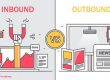
11. Vital features
 A customer is interested in how a financial institution easily deal with him or her. Thus, always remember to put the seamless features of the institution. The above picture is of a financial institution named Shubban Investments which shows how do they work with the customers.
12. Quality content
No one is interested in reading long essays. Therefore, make sure that the content that you are going to add to the website qualifies for quality and not quantity. Quality content is the key to drive more visitors to the website.
13. Local content
Institutions who are also looking for organic search engine ranking on localized terms need to develop a localized content strategy. Google prioritizes content that is geographically relevant to a consumer’s location. So not expressly developing content that is highly local, your institution’s site will be at a disadvantage.
14. Multimedia content
The visitors are always fond of embracing a variety of content and the same applies to financial institutions as well. There may be some who are interested in reading a blog but few might want to go through the videos. So make sure that you add all type of content on your website.
15. Community support content
It is the responsibility of every financial institution to make every visitor feel good about themselves. Thus, create a content that supports each and every community and give them a “feel good” facet of the institution, then there is nothing like it.
16. Flexible Content Management System
The content management system that powers the website must be wisely selected. Usually, the institutions go for out-of-the-box features, customization opportunities, ease of use, integration capabilities, security, SEO tools, workflow options, scalability, and of course, associated fees.
17. Internal links
Navigational menu is the most common way to drive the traffic to the inner pages. But apart from that, the content should provide more chance to the visitors to go to the internal pages. Your content gives the opportunity to link the internal pages. This formula also strengthens the search engine optimization.
Hire us to create a highly converting Financial Service Website for you18. Contact information
It is always a necessity to provide the phone number of the institution along with address and email. This provides a sense of relief to the user that he or she knows everything about the institution and in case of any problem, the reachability is easy.
19. Business hours
Usually, the financial institutions work from morning 10 to evening 6. So make sure that the website contains the working hours and the regular day offs.
20. Social media buttons
21. Online chat feature
To be on the toes all the time is the need of the hour. So putting an online chat feature on the financial institution website can bring a lot of leads. People have doubts when it comes to finance and if they are getting an instant solution by typing their query in the chatbox, they will show more interest.
22. Newsletter signup form
 Your marketing toolbox likely includes email, but an email marketing program can only be effective if it is targeting the right users. Your website should include an email signup box, as well as, other email capture opportunities – but don’t forget to motivate them as to why they should signup.
23. Footer navigation
Footer links can help search engine rankings. While links in body copy count for more than links all by themselves, such as in a navigation bar, sidebar, or footer, they do have value because your links tell the search engines which pages are most important.
24. Contact form
A contact form on the site is a great way to encourage customers or potential customers to take the desired action. Whether you’d like them to sign up for an e-book or schedule a consultation, contact forms can help make it happen. However, the way form is set on the site has a significant impact on whether people actually bother to hit “submit.”
25. CAPTCHA or anti-spam feature
A number of financial websites offer confidential information to its customers. Therefore, while initiating any activity or transaction, it is important to protect the process. Thus, incorporate CAPTHAs to the website. This will ensure that the transactions are done by humans and not by programs or bots.
26. Personalized about us page
Every financial website compulsorily must have a special page for “About Us” information. Mention everything on that page about the company right from the inception.Don’t let this page go under the virtual dust. Keep updating it from time to time. The visitors are keenly interested in this section.
27. Inner pages content in F pattern
F stands for Fast. That’s how users read the precious content. In a few seconds, their eyes move at amazing speeds across the website’s content in a pattern that’s very different from what was taught in school.
Users first read in a horizontal movement, usually across the upper part of the content area. This initial element forms the F’s top bar.
28. Privacy policy page
The inclusion of a privacy policy page on the website uplifts the credibility of the website. Although, there is no such law in mandating the inclusion of privacy policy for internet sites, but keeping is a good thing. It;’s always safe to mention all the terms and conditions of the company over there, so in case of any emergent situation, the company is always safe. Also if you plan to run a PPC ad campaign like an ad campaign on Facebook, the terms and privacy pages are the musts.
29. Frequently Asked Questions (FAQ) page
Having an FAQ page on the website saves the valuable time of the support team and helps them to get their answers quickly. Displaying the frequently asked questions is also a great way to show off the expertise and help visitors better understand you and your product. An FAQ page can also help in boosting the SEO.
Blogs
30. Blog page
Content marketing is the part of marketing strategy which works on sharing interesting content with the audience. Having a separate blog page will also help in the progress of digital marketing as these blogs can be shared on social media platforms. There is a lot going on in the world of finance. Thus, putting up the latest updates and trends in this regard will help in driving a pretty good traffic.
31. Search Function

If the visitor is interested in reading about insurance or taxes, then he or she can easily type that in the search box and get going with the selected blog. So make sure you have proper search box on your site and it can be easily located.
32. Social Media button for each blog
Having social media buttons at the end of every blog enables the readers to share it instantly on social media websites. If the reader thinks that the blog is a good read then he or she will surely share it with others. So never forget to add those tabs at the end of the blog.
33. Comment feature
Adding a comment feature at the end of the blog will enable the reader to add their opinions about that blog in that section. Remember to keep that section after every blog.
34. Sidebar menu
There should be sidebar menu on the blog page where the most popular blog posts should appear. This option tires to engage the reader through the next blog post.
More points to consider
35. Links that are easy to recognize
Some of the pages on your website are more important than others. This includes the home page, blog page, about page and contact us page. Give common names to these links i.e. standard naming conventions like “Home”, “About”, “Contact” etc as visitors usually are aware what these pages signify.
36. Clean font
 Readable content is a huge part of every website. But one important pillar of readable content is a quality design. So, having subtle and clean fonts can grab the attention of the visitors.
The above website screenshot is one of the world’s best financial services named BetterWealth. As it is visible that the fonts and the entire design setup is really simple, clean and subtle for eyes.
37. Mobile responsive
Google has explained why mobile is so important in their own words, and the number one reason they cite is everyone has smartphones, and they’re constantly using them to search. Your website will look great and function well on any device, provided you use responsive web design to build or redesign your site.
38. Hamburger menu on mobile site
The Ham Burger menu that is typically found on the upper right or left corner of the website on the mobile is an easy way for the user to switch to the different sections. It is not possible on a mobile phone to put the list of menu horizontally. Thus, the Ham Burger menu is used for that. It makes the website look organized on mobile.
39. Automatic sitemap creation
Sitemaps, as the name implies, are just a map of your site – i.e. on one single page you show the structure of your site, its pages, posts, the links between them, etc. Sitemaps make navigating your site easier and having an updated sitemap on your site is good both for your users and for search engines.
40. Ability to easily update the page
The website should be developed in such a way that the developer should be able to easily update it from time to time. More clutter on the web page will lead to more time in updating the website.
41. Easy to update url structure
An important component that marketers often overlook is the URL structure because of the technical excuses. Most Content Management systems, like WordPress, provide you with a structure for your URL out-of-the-box. But a little attention and direction can really give your content a step forward in performing online.
42. Reliable fast hosting
It’s crucial to choose a reliable web hosting company to so that the website remains safe and accessible all year round. There are a lot of options available in the market but choosing the apt one is important as the whole business is dependent on that.
43. Security
An unprotected website is a security risk to customers, other businesses, and public/government sites. It allows for the spread and escalation of malware, attacks on other websites, and even attacks against national targets and infrastructure.
44. Auto website backup feature
Site backups are a snapshot of all the files and data that make up the site. It’s a great idea to have regular offsite backups of the website created automatically. You should always treat Backups as the insurance of your financial institution website.
45. Cross browser compatible
Visitors use various other browsers to enter the website. Thus, make sure that the website is compatible with almost all the popularly used browsers. The website won’t appear in exactly the same way across each one, but it will need to look just as impressive.
46. Google webmaster tools integration
This tool enables the developer to communicate with Google and adjust many aspects of how Google sees your site. This includes external and internal links to the site, adjust crawl rate at which Google bot indexes your site, check the keywords and many more. Thus, make sure that your page is integrated with the Google webmaster tool.
47. Check for loading time
When looking for information online, nothing irritates the visitors more than slow loading times. Customers can be turned away completely due to this issue. Testing the website ahead of time will help to pinpoint any loading time issues, and these can be fixed before the site’s official release.
Also read: Use Google tag manager for better performance
48. Use browser cache to increase speed
The first time someone comes to your website, they have to download the HTML document, stylesheets, javascript files and images before being able to use your page. Once the page has been loaded and the different components stored in the user’s cache. Enabling caching can shave off a significant amount of time of returning visitors and provide a better user experience.
49. Schema.org
 You can use the schema code inside your web pages so that Google and other search engines will show more informative data of your page. Schema.org guide helps to get the speed with Microdata and schema.org so that you can start adding markup to the web pages.
50. Visible tabs for advisor and employee login
The tabs of advisor and employee login should be clearly visible on the page. It becomes easy for the employees to directly go there instead of searching the login option.
51. Calculator option
 Since, it is going to be a website for financial services that is completely related to numbers, then an option of calculator is a must on the page. The visitors can easily calculate EMIs, payments and loads through that calculator.
This also saves the time of the support team as the visitor can independently work on that area.
52. Section for live stock markets
Including a live stock market board on your website can make it more visually appealing as the visitor can track the live stock market easily and decide his or her portfolio.
Now, most bids to buy and sell stocks are made electronically, this is a great way to divert traffic to your website.
53. Eligibility information
One can’t control who checks out the website from where. Prospective customers or members may visit the site and the can be interested enough to join or apply, so be sure to very clearly present eligibility information.
54. Mobile app download link
Don’t forget to include the link of the mobile app of your financial institution (if there is any). If the user is browsing it on mobile, he or she should be instantly directed to the app store to download the app.
Not only you should link these from your Mobile Banking page, but including links in the footer of all of your site pages may also increase awareness and adoption.
55. Product comparison chart
If you provide the comparative analysis of loans, accounts with other institutions, your audience will be overwhelmed to see that. It outlines reasons for selecting one account over another. This comparative experience allows a visitor to quickly assess options and decide what solutions they would like to consider further.
56. Rate management
Rate changes are among the most frequent updates that a finance website administrator will make. As such, managing that rate information centrally within a CMS creates efficiencies for administrators. Plan to have a rate management tool built in CMS for easy, centralized rates management throughout site.
57. Online account opening
The ultimate aim to open a website of a financial service institute is to have the 30% of the work done online without any hassle. Thus, adding the online account opening forms on the website can make it easy for the visitors as well. This will increase the website footfalls eventually.
58. Online loan application
If you provide loans or accept leads who are looking for loans, inviting the loan applications online will save half of the precious time of the employees. Keep an option of online loan application on the website. This will also enhance the user application as the user will be able to apply for a loan from his mobile or computer.
59. Financial resources
The visitors should have a reason to come back to your site with a purpose. Therefore adding various resources like whitepaper download option, informative articles, Nav view, NSE NMF view, pay online will make the website stand out. This also supports the users into their financial journey on the website.
60. List the investors
Adding the investors tab on the financial services website will catch the visitor’s attention. It will also increase the credibility and authenticity of the website in the eyes of the users.
61. Google analytics integration
Most institutions want more powerful site analytics when they launch their new site, so are looking to more sophisticated tracking solutions like Google Tag Manager, combined with custom goals, third party tracking, dashboards, reporting and more.
Thus, the new site should properly integrate with the basic codes that are used on the current site.
62. Custom analytics
Tracking basic analytics on a financial institution website is must for the course. But being able to track conversions on third-party platforms as well as online and offline advertising effectiveness can be a resource-intensive challenge. However, Google Analytics and other platforms are now offering solutions that can make this more realistic for institutions.
63. Easy third-party integration
Most of the financial institutions depend on third party in regard with their website. There are many activities that take place on the finance website through the vendors. This includes opening bank accounts, online transactions, ATM withdrawals and much more.
The users don’t have any clue what happens behind the scenes. but it is the responsibility of the institution to provide a hassle free experience to its users.
64. Stock images
The content is the intellectual property of a website and falls under copyright laws. When incorporating images into your site’s content, make sure to receive written permission for use and pay relevant fees, if applicable. There are also sites that offer access to copyright-free images.
65. Usability
You can increase the usability of a financial institution website by displaying all the necessary content that a visitor is expecting on your page. If a viewer is reading your blog and wants to subscribe to an email newsletter, do they have to hunt for the opt-in form? And many more key elements are essential to review when optimizing the usability of your site.
66. Promotional space
Always choose the promotional space carefully on the home page, as well as internal pages. So that promotions are relevant, helpful and not overwhelming. Similarly, an internal process for determining how to manage these once the site launches will help avoid the patchwork-quilt effect.
67. Effective color scheme

The color scheme of the website should be soothing to the eyes. Being a financial institution website, it is important to choose formal colors like white, blue, light brown etc. The above website has chosen the colors like grey and purple which creates a good impact on the visitors.
Always keep the font in black color as it looks good on any light colored theme.
68. Keep a sneak-peak of social media
Keeping a small section of the social media profiles and its update on the page will enhance the user experience and it will drive more engagement.
 The don’ts
69. Avoid background music
Putting a background music on your website will take out the charm of the design and other elements. Avoid putting it. In case there is any video that is auto-playing once you open the website page, then it is fine. Otherwise the website looks shabby.
70. Do not upload videos on website server
Adding videos to the website can give a rich user experience. But adding it through a website server won’t be a good idea. Uploading the videos on web server means uploading it on the site, using the site’s server space. Sometimes there are limitation to hosting server space. If you host videos there, you might exhaust your space quota. Second thing is – the bandwidth, which you might have limited. Letting your viewers play videos from your own server may cost you heavy bandwidths and you might exhaust that quota. It will make your site slow.
The best possible solution is host public videos on YouTube and private or subscription based videos on Vimeo or Wistia. And insert these videos on your site. When you upload a video on sites like YouTube or Vimeo, they process each video for a better web experience.
As you get along with the process of website building for your financial service institute, follow this ultimate guide that will help you in outlining your requirements. So get going and good luck with your financial service website that would have best conversions!