

Many websites are nowadays jumping on the mobile platform to increase their reach. They are working and performing pretty good with an eye-catching user interface and user experience. The mobile web design SEO, UI SEO, and UX SEO are being incorporated into the design to get the best engagement rates.
We all know the fact that a picture speaks a thousand words. But what if that picture is not even worth a look? Similarly, displaying pictures on web and mobile is not an easy business. If you are making the images to big then your website will lag behind in ranking. If you are putting small images then the visitor won’t be able to see them properly.
Many factors should be taken into consideration while creating a web-page for desktop as well as mobile. A good SEO will drive more customers. Thus, taking care if the search rankings along with a good UX will help the visitor look for the needed information. The more a visitor stays on a website, the better it.
There is a cut-throat competition in the market, even for SEO these days. Every website thrives to get the top SEO ranking for better results. The SEO has also become sharper now. And because of this, it is not just about the quality content, there are other aspects as well that need to be considered to increase the search engine rankings.
Many businesses understand the importance of search engine optimization and hire expert SEO company to do such optimizations for them on regular basis.
Responsive and mobile optimized
If your website really looks good on the desktop, make sure that it is equally good on mobile. People are preferring mobiles to browse everything. Even if you are sitting in a coffee house and you want to look for good hotels nearby, you will browse it on your phone.

If we take a look at Zomato’s website, then one can find it really soothing. Though it is related to hotels and food, they have given it that feel and everything looks clean. If we want to find any restaurant, the first link appears in the search result is of Zomato.
Website responsiveness should be given the highest priority as Google suggests that it is important. It makes it easier for users to share and link to your content with a single URL. Also, it helps Google’s algorithms accurately assign indexing properties to the page rather than needing to signal the existence of corresponding desktop/mobile pages.
With more and more people making use of mobile devices, having a responsive website is easy and a must for great UX and SEO.
Task-based design
Whenever creating a website, always think from the user’s point of view. How he or she will behave once they are on your website. Think a moment about the things visitors do on your website. Decide on top tasks for your mobile website. And optimize mobile UX to make sure these are accessible with the most ease possible.
The user has a purpose of visiting the website, so make sure the purpose is fulfilled. If a user is on an e-commerce website, then whatever product he or she is browsing or want to purchase, that process should get completed without them falling into any hassle.
Therefore, the design should always be based on the task which a user usually perform while navigating through the website.
Add a sticky menu with a search option

Adding a sticky menu with search option will help the user to get what exactly he or she is looking for. In case of the given screenshot of MakeMyTrip, all the options that usually a traveler prefers are given on the sticky notes.
Along with this, also make sure that when the user clicks on one of those options, the internal pages look equally good as the home-page. The user should be urged to complete the action.
Use sensitive navigation
According to Google, “The navigation of a website is important in helping visitors quickly find the content they want. It can also help search engines understand what content the webmaster thinks is important.”
A website’s navigation process should always be taken into consideration while designing a website. But along with that, the SEO should be highly checked. If all the factors are aligned together properly then there will be enhanced UX.
A sensitive navigation improves the UX of the website and if executed in an apt manner also helps in escalating the conversion rates. The calls-to-action buttons should also work in sync with the whole navigation process. If the set up is correct, then the visitor will be driven towards the automatically which you have set for the website.
Support your content with graphics
Images play a lead role in attracting more users towards the website. Images and graphics add more value to the content. It is also helpful in building the required aura for a better UX. When the image, the title, and the content is completely relevant to each other, then the chances of your website showing up in the search results are higher. This will be helpful if the proper keywords are used for the content.
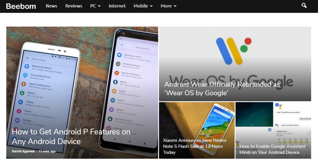
The above website is a technology website that posts updates about the technology world. The content is properly supported with eye-catching graphics and images.
Less loading time
More clutter on the website leads to higher loading time. But their various tools available through which the loading time can be reduced. AMP is an open-source library. It provides a straightforward way to create web pages that are compelling, smooth, and load near instantaneously for users. The pages are just web pages that you can link to and are controlled by you.
 AMP builds on your existing skill sets and frameworks to create web pages. AMP is supported by many different platforms, and it’s compatible across browsers.
Many times you have seen that whenever an article is updated on Facebook and when you click on it, it gets opened instantly. So that is the magic of Facebook Instant. This platform makes the loading time to zero directly.
It is very vital for every website to make sure that the loading time is less in order to enhance the UX.
This will make the visitor go deeper into the website and stay for long to fulfill your goal funnel.
Watch the color tones
There is a lot of difference on looking at a site on desktop and on mobile. Your site must be doing wonders on the desktop with rainbow colors, but that is not the case on mobile. Tone down the colors when it comes to mobile. The UI should be easy to look at.


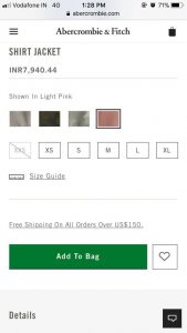
Above is the website of a popular clothing brand Abercrombie & Fitch. It uses the basic color palette to showcase all the content with powerful pictures. The combination of basic colors with beautiful pictures draw the user’s eyes to the products, rather than the elements of the site.
The simplicity of the homepage presents the user with clear options to begin shopping, which is the main purpose of the web page. The promotion/advertisement bar the middle of the page is also a great addition to encourage action and draw attention to sales.
By keeping a monochromatic style and minimizing design elements, Abercrombie has allowed their clothing to stand out as the main attraction.
Consistency in color will also boost usability and keep layouts simple. Color is a great visual cue in mobile design and with such a small screen, a cohesive color palette is vital for guiding users throughout your site
Minimize design elements
A user is always hurried to get the job done. Thus, always avoid designing such elements that could divert user’s attention. By simplifying the layout, especially on a mobile phone will help the user to navigate to the exact location on the web-page.
Always remember, whitespace is not a bad thing. The above screenshots of Abercrombie & Fitch are the proof for that. It helps the visitor to discover the information quickly.
Don’t use too many fonts
While there aren’t really any definitive rules, it’s best to keep that third font out of the picture and stick to two. Adding in a different font can completely change the balance and tone of your design. So as with many things, it’s crucial for you to use your own judgment.
If you are using too many fonts on the website, then it also disturbs the concentration of the user.

The above screenshot has 4 to 5 types of fonts. Being a user, you won’t be able to focus on anything. Everything looks so disturbed and cluttered that the user will close the website immediately.
Make sure the fonts that are used on the website are subtle, soothing and clean to look at. Align each and every element in a disciplined manner.
Regular testing
Whenever a website is created, always test its appearance on both mobile and desktop. It should look comfortable on both the devices. Make sure that every change made on the desktop website appears properly on mobile as well.
Keep testing every time you make the changes. This is how the mobile website will stay updated.
Revamping a website can be a big task but keeping it simple is not. Always keep everything simple and clutter free. Think from a user’s perspective and you will be able to understand it. Include only those things on the page which are necessary. If everything works out well, then due to your UI SEO, UX SEO, and mobile web design SEO, your site will rank at the top of the Google rankings.